
How to take better screenshots in 2026
A practical guide to framing, annotation, and consistency for screenshots people actually want to read.
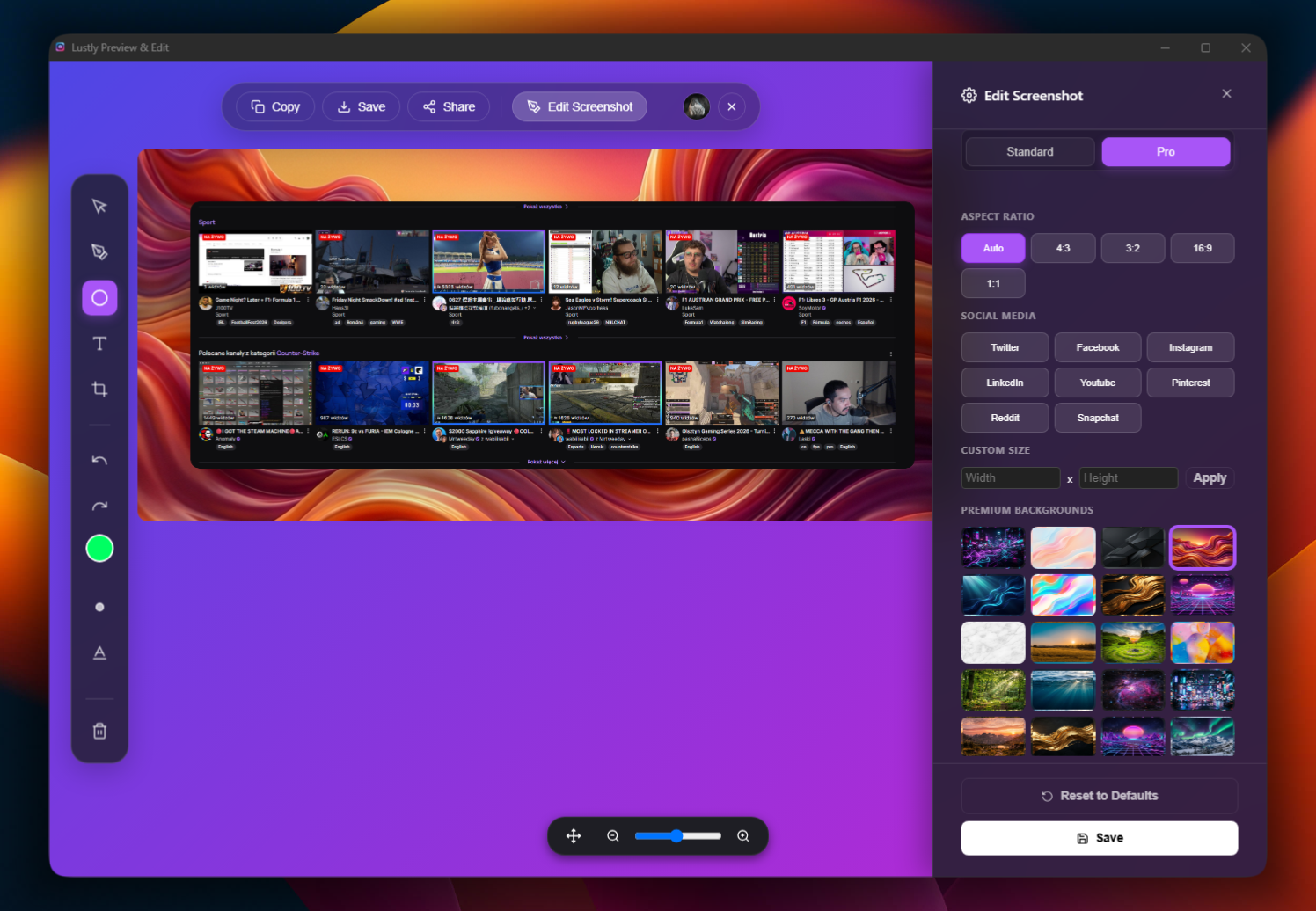
Better screenshots are rarely about sharper resolution. The difference between a useful screenshot and a forgettable one is context. A raw crop says 'look at this.' A framed, padded, clearly annotated image says 'look here, and here is why.'
Start with the frame. Wrapping a capture in a browser window tells the viewer they are looking at a real product, not a floating rectangle. Match the frame to the audience—macOS for design conversations, Windows for enterprise, or a clean neutral frame for universal sharing.
Use one deliberate annotation. One arrow pointing at the single thing that matters beats a cluster of highlights, circles, and labels. Viewers stop reading when the image shouts in five directions at once.
Blur before sharing. Tabs, notification badges, names, emails, and tokens have no business in a public screenshot. A ten-second blur saves hours of regret.
Small details carry weight. Consistent padding, subtle shadows, and matching corner radius turn a dumped crop into a designed visual. These are the choices that separate polished screenshots from the ones people scroll past.
Lustly was built around this idea: frame, annotate, blur, and export without leaving the browser. The best screenshot tools stay invisible. The result should look like effort was spent, even when it wasn't.